0
svar
31
visningar

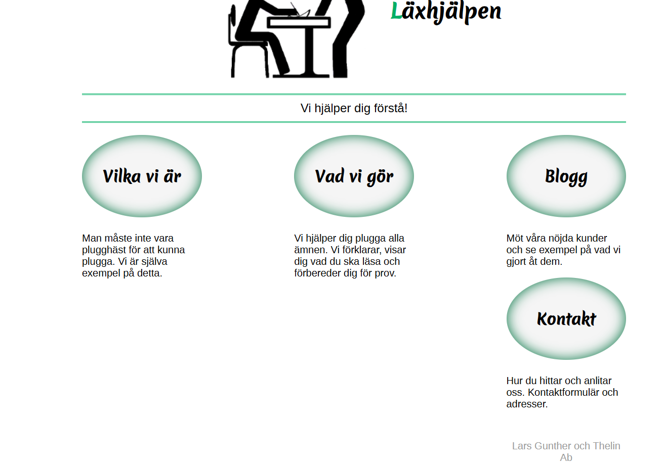
Footer felplacerad
Hittar inte felet, varför är min footer inte lika bred och centrerad som min header?
@charset "UTF-8";
/*
==================================================================================
Global rules
==================================================================================
*/
html {
    margin: 2%;
}
body {
    margin: auto; /*sidan centreras*/
    max-width: 860px;
    font-family: "Helvetica Neue", "Liberation Sans", Calibri, Arial, sans-serif;
    font-size: 100%; /*startvärde*/
}
/*
   section, header, footer {
    outline: 1px solid red;
    }

*/
/*
==================================================================================
Rules for reusable components
==================================================================================
*/
.dborder {
    border: 1px solid #ccc;
    padding: 5px;
}
/*
==================================================================================
Page header, all pages
==================================================================================
*/
header {
    text-align: center;
}
.startpage header,
.startpage footer {
    flex: 0 0 100%;
}
/*
==================================================================================
Page footer rules
==================================================================================
*/
footer {
    margin-top: 3em;
    text-align: center;
    color: #999;
}
    /*
==================================================================================
Main site navigation
==================================================================================
*/
    .menu h2 {
    font-family: 'Merienda One', cursive;
    box-shadow: inset 0 0 20px #007241;
    border-radius: 50%;
    margin: 0 0 1em;
    padding: 2em 0;
    background-color: #F5F5F5; /*väldigt ljusgrå*/
    text-align: center;
}
.menu a:link,
.menu a:visited {
    text-decoration: none;
    color: #000;
}

.menu a:focus,
.menu a:hover {
    text-decoration: underline;
    color: #A62F00;
}

.menu a:active {
    text-decoration: underline;
    color: #FF4900;
}

/*
==================================================================================
Start page rules
==================================================================================
*/
.startpage .Logo {
    width: 235px;
    height: 198px;
}
.startpage {
    display: flex;
    flex-wrap: wrap;
    justify-content: space-between;
}
.startpage section {
    flex: 0 0 22%;
}
.starpage h1 {
    font-size: 500%; /*gigantisk rubrik på startsidan*/
}
.hwrap {
    display: flex; /*gör diven till en flex container*/
    flex-wrap: wrap;  /*radbryt vid behov*/
    align-items: center; /*lägg till element centrerat vettikalt*/
    justify-content: center; /*och intill varandra centrerat*/
}
.hwrap > a {
    margin-right: 30px;
}
/*
==================================================================================
Subpages
==================================================================================
*/
.subpage .Logo {
    width: 146px;
    height: 123px;
}
.subpage h1 {
    font-size: 2.6rem;
}
.subpage .hwrap {
    justify-content: space-between;
}.subpage .hwrap > a, nav {
     flex: 0 1 20%;
     min-width: 146%;
     margin-right: 10px;
     outline: 1px solid;
 }
 .subpage .hwrap > h1, div[role=main] {
     flex: 1 1 300px;
 }
/*
==================================================================================
Tables
==================================================================================
*/
table {
    border-spacing: 0;
    border: 1px solid #d3d3d3;
    width: 96%;
    margin: 1em auto 2em;
    border-radius: 5px;
    box-shadow: 0 0 4px rgba(0, 0, 0, 0.2);
}
thead {
    font-size: 150%;
    text-shadow: #fff 1px 1px 1px;
}
th, td {
    padding: 1.1rem 1.8rem 1.1rem;
}
th {
    padding-top: 1.4rem;
    background: #ddd;
    text-align: left;
}
td {
    border-top: 1px solid #e0e0e0;
    border-right: 1px solid #e0e0e0;
}
th:not(:Last-child) {
    border-right: 1px solid #f2f2f2;
}
/*
==================================================================================
Nivo Slider
==================================================================================
*/
.nivo-caption {
    text-align: center;
}
/*
==================================================================================
Forms (contact page)
==================================================================================
*/
fieldset {
    padding: 1em;
    border-radius: 10px;
    margin-bottom: 10px;
}
legend {
    font-size: larger;
}
form p {
    display: flex;
    flex-wrap: wrap;
    width: 100%;
}
lable {
    flex: 0 1 10ch;
    tect-align: right;
    padding-right: 1ch;
}
.regfield {
    flex: 0 0 2ch;
    order: 1;
    text-align: center;
    padding-right: 0;
}
input[type=text],
input[type=Email]
textarea {
    flex: 1 1 25ch;
    max-width: 300px;
}
textarea {
    height: 5em;
    resize: vertical;
}
input[type="submit"] {
    display: block;
    margin: auto;
}
/*
==================================================================================
Blog page, show and edit
==================================================================================
*/
/*
==================================================================================
Adaptive design
==================================================================================
*/
h1 > span {
    color: #a62f00;
}
.tagline { /*kantlinje*/
    font-size: 120%;
    padding: 0.5em; /*avstånd till kantlinjen(radhöjd)*/
    border-top: 3px double #00AF64;
    border-bottom: 3px double #00AF64;
    margin: 1em 0;
}
h1::first-Letter {
    color: #00AF64;
}
h1 {
    font-family: 'Merienda One', cursive;
}